 Some users find the
 plotms task memory-hungry compared to the stand-alone plotter casaplotms; the functionality should be the same in either.The goal of this tutorial is to demonstrate the process of data reduction, calibration and imaging of EVN VLBI data using the CASA software package. Where appropriate and feasible, the calibration steps are explained on the assumption that the reader is not necessarily very familiar with CASA or with VLBI data processing.
You will need a version of CASA that supports fringe-fitting; some additional Python scripts are also needed to process EVN calibration tables for use with CASA. You need append_tsys.py, flag,py, key.py and gc.py. Download these to the computer you will be using for the data reduction and set an environmental variable ‘$PYCAPATH’ to point to the directory you put them in. (Note that we assume here and below that you are using the bash shell or similar; the syntax will need to be adjusted for csh or tcsh.)
export PYCAPATH=<path to script directory>
export PYTHONPATH=<path to script directory>:$PYTHONPATHThis tutorial uses data from the EVN experiment N14C3; which is available in the EVN archive.
The data is distributed in the form of FITS-IDI files; you will also need some calibration data from the “pipeline” page, specifically, the “UVFLG flagged data” and the “Associated EVN calibration” (an .antab.gz file, which you should unzip after downloading).
The EVN pipeline itself is a preliminary data reduction run by support scientists at JIVE, using gain curve and system temperature information provided by participating stations to produce an a priori amplitude calibration table, stored in the antab table. This and the preliminary flagging table provide a good starting point for calibration. The pipeline run at JIVE produces diagnostic plots and preliminary images of the sources, but these are not intended as science products; the full data reduction, e.g. fringe-fit, bandpass calibration and imaging, should be done by the user.
Currently, as we have seen, the EVN archive contains FITS-IDI files for use with AIPS. CASA, however, natively uses a data format called a Measurement Set (MS). In addition to converting the FITS-IDI data, we also need to convert the a priori calibration data and flagging information into a form suitable for CASA. This section describes the steps required for this, which are carried at in the Unix shell before starting a CASA session for the interactive calibration steps.
The first pre-processing steps are done in Python. The use of the CASA python distribution is recommended, any Python 2.7 should work as long as the paths are properly set. Do not use Python3, it causes problems.
Translating the flagging to a format CASA can read is straightforward:
python $PYCAPATH/flag.py n14c3.uvflg n14c3_1_1.IDI1 > n14c3.flagNote that this command need only be run for the first IDI file. The command gives a deprecation warning for pyfits, which can be ignored.
The system temperatures (“Tsys”) measured at the stations during the observation will be combined in CASA with the so-called dpfu (degrees per flux unit) that is included in the gaincurve table described below. This combination is the VLBI way of doing flux calibration. When using the VLA it is the user’s job to schedule a flux calibrator source and do the flux calibration manually in CASA, with the setjy and gaincal tasks, but that relies on (among other things) a catalogue of flux calibrators with known fluxes, and at the very small scales of VLBI, sources fluxes are more variable, and the sources are more likely to have discernable structure, so we use the Tsys values for amplitude calibration instead.
First we have to append the Tsys values from the ANTAB file to the FITS-IDI files which we will read into CASA.
casa --nogui -c $PYCAPATH/append_tsys.py n14c3.antab n14c3_1_1.IDI*As each antenna moves to track the observed sources, gravity affects the shape of the dish, and the distortions in turn affect the gain of the instrument. This information is summarised in the gain curve table. The effect is calculated purely from the pointing direction of the antenna and its (empirically observed) characteristics.
We generate the gain curve (and dpfu) from the Antab file using the script gc.py:
casa --nogui -c $PYCAPATH/gc.py n14c3.antab EVN.gcIn AIPS the gain curve is defined in terms of power versus elevation; in CASA the units are voltage versus zenith angle.
The square root involved in translating powers to voltages (recall that P = V^2/R) can cause trouble when translating the AIPS ANTAB format - the effective gain can become negative at some angles. We give a workaround below. If the gain becomes negative, the program will exit with an error. In that case, you can try restricting the elevation range by setting -l <value> -u <value>, which defines the lower and upper elevation limits (in degrees):
casa --nogui -c $PYCAPATH/gc.py n14c3.antab EVN.gc -l 20 -u 75(Note that here we do use CASA itself in batch mode, but we just run a single script from a shell.)
For the rest of the calibration we will work within CASA, which you should now start.
First we import the FITS-IDI data into a Measurement Set. We import the glob module because it allows us to reproduce the kind of file wild-card syntax that the shell also uses. (You can also supply a list of files to the fitsidifile parameter if you prefer.)
import glob
importfitsidi(vis='n14c3.ms', fitsidifile=sorted(glob.glob('n14c3*IDI?')),
              constobsid=True, scanreindexgap_s=15.0)
The parameter scanreindexgap_s defines the gaps between individual scans. It works slightly different than in AIPS. As a consequence, scan numbers in CASA will be different from scan numbers in AIPS. CASA will warn that the dish diameter column is empty; this is fine. The IDI FITS files doesn’t include dish diameters, and they are not needed for VLBI calibration.
Then we apply the flag table we derived earlier
flagdata(vis='n14c3.ms', mode='list', inpfile='n14c3.flag',
         reason='any', action='apply', flagbackup=True, savepars=False)
and we generate (at last!) the two a priori amplitude calibration tables we will need throughout the following:
gencal(vis='n14c3.ms', caltable='n14c3.tsys',
       caltype='tsys', uniform=False)
gencal(vis='n14c3.ms', caltable='n14c3.gcal',
       caltype='gc', infile='EVN.gc')
The first gencal will report a few of warnings for antenna 3 and 5 of the form:
WARN Tsys data for ant id=3 (pol=1) in spw 1 at t=2014/10/22/12:35:12.0 are all negative or zero will be entirely flagged.This is much less severe than it may seem – each timestamp and spectral window is reported separately for each antenna; in fact very little data has been flagged.
It is also worthwhile to note here that CASA also allows you to use the tasks in an AIPS-like style: input importfitsidi will give you an overview of all parameters available for this task and their current values. To reset the task to default values simply type: default importfitsidi This functionality is available for all CASA tasks.
Everything up to this point has been an elaborate set of preliminaries; now we can start the real business of data reduction in CASA.
Almost certainly the first thing you want from CASA is a summary of the experiment. The listobs task provides this:
The output (trimmed to exclude timestamps and some other uninteresting details) a long list of scans and their times and should also include the following information about sources and antennas:
Fields: 5
  ID   Code Name                RA               Decl           Epoch        nRows
  0         J1640+3946          16:40:29.632770 +39.46.46.02836 J2000       254400
  1         3C345               16:42:58.809965 +39.48.36.99402 J2000       383520
  2         J1849+3024          18:49:20.103406 +30.24.14.23712 J2000       276480
  3         1848+283            18:50:27.589825 +28.25.13.15523 J2000       388800
  4         2023+336            20:25:10.842114 +33.43.00.21435 J2000       542880
Antennas: 12:
  ID   Name  Station   Diam.    Long.         Lat.                Offset from array center (m)                ITRF Geocentric coordinates (m)
                                                                     East         North     Elevation               x               y               z
  0    EF    EF        0.0  m   +006.53.01.0  +50.20.09.1          0.0000        0.0000  6365855.3595  4033947.234200   486990.818800  4900431.012900
  1    WB    WB        0.0  m   +006.38.00.0  +52.43.48.0          0.0000        0.0000  6364640.6582  3828445.418100   445223.903400  5064921.723400
  2    JB    JB        0.0  m   -002.18.30.9  +53.03.06.6         -0.0000        0.0000  6364633.4245  3822625.831700  -154105.346600  5086486.205800
  3    ON    ON        0.0  m   +011.55.04.0  +57.13.05.3          0.0000        0.0000  6363057.6347  3370965.885800   711466.227900  5349664.219900
  4    NT    NT        0.0  m   +014.59.20.6  +36.41.29.4          0.0000        0.0000  6370620.8444  4934562.806300  1321201.578200  3806484.762100
  5    TR    TR        0.0  m   +018.33.50.6  +52.54.37.8          0.0000        0.0000  6364638.2686  3638558.224900  1221970.012900  5077036.893900
  6    SV    SV        0.0  m   +029.46.55.0  +60.22.02.0          0.0000        0.0000  6362046.4147  2730173.638900  1562442.815400  5529969.162000
  7    ZC    ZC        0.0  m   +041.33.54.6  +43.35.44.2          0.0000        0.0000  6369116.8289  3451207.501600  3060375.451900  4391915.078200
  8    BD    BD        0.0  m   +102.14.02.1  +51.34.59.0          0.0000        0.0000  6365805.2953  -838201.115900  3865751.556700  4987670.884200
  9    SH    SH        0.0  m   +121.11.58.8  +30.55.45.2          0.0000        0.0000  6372496.1653 -2831687.440400  4675733.471100  3275327.483500
  10   HH    HH        0.0  m   +027.41.07.4  -25.44.20.1          0.0000       -0.0000  6375503.2371  5085442.763700  2668263.836600 -2768696.719000
11 YS YS 0.0 m -003.05.12.7 +40.20.05.0 -0.0000 0.0000 6370140.8869 4848761.775700 -261484.147100 4123085.034600It can be useful to do some data inspection at this stage to ensure that the a-priori calibration has no problems. First, we apply the a priori calibrations so we can plot the calibrated data. The calibrated data is written to the ‘CORRECTED_DATA’ (called “corrected” when choosing data to plot in plotms). The original data column (‘DATA’ in the table browser, “data” in plotms) is unaffected by the applycal task.
Note that in VLBI we always apply parallactic angle corrections!
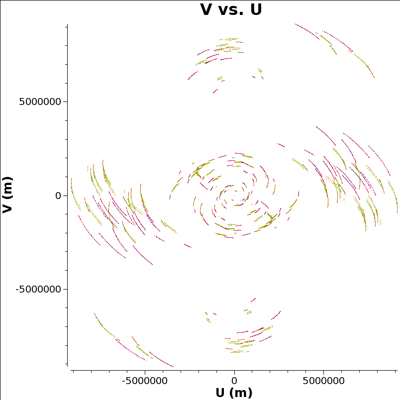
Let’s look at the UV coverage, colored by source:
Some users find the plotms task memory-hungry compared to the stand-alone plotter casaplotms; the functionality should be the same in either.
In the UV plane each baseline traces an ellipse as the earth rotates. When the UV plane is evenly filled in, as here, it is possible to make a good image in the image plane that is the two-dimensional Fourier transform of the UV plane. That’s one reason why we pick this network monitoring experiment as an example to reduce all the way to visualisation.
Now we plot the a priori corrected amplitudes for all the sources against UV distance. Note the antenna syntax we use to select only cross-correlations. (Auto correlations are really unhelpful for this plot.) Also we only plot parallel hands of polarisation. This plot can take a long time to generate, and plotms seems non-responsive. Let it run for 10 minutes or so, go get coffee, chat to your neighbours. Or just skip this step.
plotms(vis="n14c3.ms", xaxis='uvdist', yaxis='amplitude', antenna='*&*',
       correlation='ll,rr', field='', ydatacolumn='corrected',
       coloraxis='field')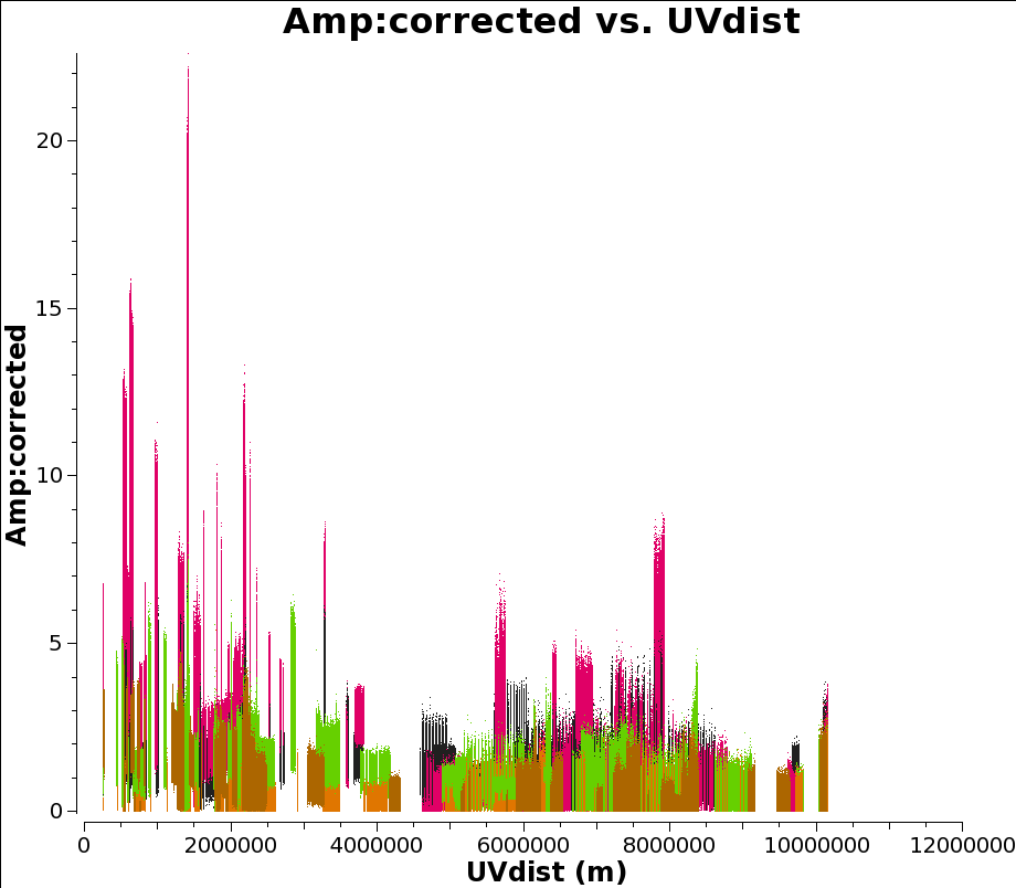
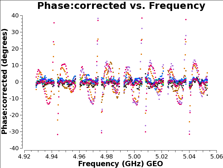
Now let’s look at some corrected amplitudes against frequency for our reference antenna, EF. (We will use EF as our reference antenna for fringe-fitting below, because it is the biggest, and therefore the most sensitive, antenna in the EVN.)
plotms(vis="n14c3.ms", xaxis='frequency', antenna='EF', yaxis='amplitude',
       ydatacolumn='corrected', correlation='ll,rr',
       coloraxis='baseline', scan='37')
It’s not a bad idea to look at the baselines separately just in case something has gone wrong with, for example, the right hand polarisation for SV. Note that for this plot you need to click on the green arrow button in the GUI to see all baselines.
plotms(vis="n14c3.ms", xaxis='frequency', antenna='EF', yaxis='amplitude',
       ydatacolumn='corrected', correlation='ll,rr',
iteraxis='baseline', coloraxis='corr', scan='2')From the plots above we find that something has gone wrong with the right hand polarisation for SV, we should probably flag it:
Much of CASA’s calibration logic requires both polarizations to be available, so in practice we will not be able to fringe-fit SV at all, even though the left-hand polarization is fine.
While we’re looking at the data, the bandpass profile of the amplitudes shows us that they fall away drastically near the edges. They don’t contain a lot of useful information; it is conventional to flag the outer 10% of the band, and in this case we have thirty-two channels (0 to 31) so we flag 0,1 and 2 and 29,30 and 31. Not flagging the edge-channels can cause problems in the later stages of calibration.
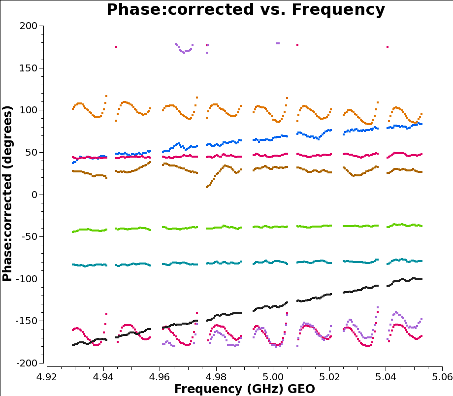
If you look at plots of phase against frequency in plotms you will see that there are slopes, which correspond to delays that have not been corrected by the geometric model used in CALC and included into the correlator. At the frequencies used by the EVN some of these typically arise from propagation through the troposphere. But some also arise from instrumental effects: in systems where different spectral windows have different electronics, the signal chain itself can introduce delays. Think of a situation where the different data from spectral windows travel along cables of slightly different lengths. (We’re looking at delays of the order of nanoseconds, so it doesn’t take much.)
Note that although the calibration tables we have applied so far simply rescale the amplitude, by requiring parallactic angle corrections to be applied with them, the phases will also be differ between the corrected and the uncorrected data, depending on the mounts of each antenna and the distance between them.
The instrumental delays show up as jumps in phase between spectral windows: see for example the brown (NT) and red (WB) baselines to the reference station EF in the plot below, generated with the following plotms command:
plotms(vis='n14c3.ms', xaxis='frequency', yaxis='phase',
       ydatacolumn='data', antenna="EF", correlation='ll',
       coloraxis='baseline', timerange='13:18:00~13:20:00',
       averagedata=True, avgtime='120')
We’re using the timerange 13:17:20 to 13:21:20 here, which corresponds to scan 37 on the bright calibrator 1848+283. To remove the instrumental delay for each frequency element we require a high signal-to-noise ratio in each spectral window separately so bright calibrators are used for this purpose.
Instead of setting a timerange for the task, CASA allows you to select the whole scan. However, for a nice bright calibrator a timerange of order a minute should be sufficient, faster and more accurate.
fringefit(vis="n14c3.ms", caltable= "n14c3.sbd",
                timerange='13:18:00~13:20:00',
                solint='inf',
                zerorates=True,
                refant='EF',
                minsnr=50,
                gaintable=['n14c3.gcal', 'n14c3.tsys'], parang=True)
We also zero the rates: the instrumental delay calibration is intended to correct for diffences in signal paths between the spectral windows at individual antennas, which we assume are constant over the experiment and which we will accordingly apply to the whole experiment. If we allow non-zero rates the application of this calibration would extrapolate their effects across the whole experiment, and the term linear in time would dominate the correction far away from the time used to calculate the correction.
The fringefit task should report the signal to noise ratio for each station, as well as the number of iterations it requires to converge on a solution. These are good estimates of how the task perforsm, for this dataset the signal to noise is very high, and the number of iterations is of order 10 or less.
In most CASA calibration steps, as above, we feed the new calibration task a list of gaintables to be applied on the fly while calculating the solutions. Unfortunately, the plotting tool plotms has traditionally required calibrations to be explicitly applied before plotting. A new mechanism is under development to make that unnecessary, but for now it remains best practice. So we apply the calibrations and plot.
plotms(vis='n14c3.ms', xaxis='frequency', yaxis='phase',
       ydatacolumn='corrected', antenna="EF", correlation='ll',
       coloraxis='baseline', timerange='13:18:00~13:20:00',
       averagedata=True, avgtime='120')
If you have kept the plot open, you can turn on the “reload” check box, and select “corrected” for the data column in the Axes tab of plotms. It’s worth putting in some effort to learn how to use plotms - it is a complex tool, but a powerful one.
Alternatively, you can review the task’s settings with tget plotms and then change only the ydatacolumn argument.
After correction, on the timerange we used, the plots of phase are flattened:
But if we look instead at another timerange (here we use 12:07:00 to 12:09:00) we see below that while all the spectral windows are joined up, there are still slopes across the data.
That’s fine: as explained above, this step is only intended to join up the phase plots; we can now use multi-band fringe fitting on our phase calibrator to correct for the remaining delays: by merging all the spectral windows we get a much stronger signal to work with.
(In this dataset we use the same calibrator for phase referencing as we did for the instrumental delay calibration, and if it comes to that with modern digital back-ends many antenna fail to have jumps between spectral windows at all. But some still do, and you are invited to imagine the Heroic Age when data was more challenging.)
Now we do the real delay correction. We use a solution interval of 60s to track the delay closely over the full range of our reference calibrator, 1848+283. We’re then going to use phase referencing: we apply these solutions to our target source J1849+3024. The idea here is that our phase calibrator is bright and close to our science target in the sky so that the atmospheric delays can be calculated on the calibrator, where there is plenty of signal, and transfered to our science target where there may not be. (In practice, J1849+3024 is also pretty bright, but we can always pretend.)
The reason we need to correct the delays at all is that we want to average the data across frequency channels, and if there is a phase slope resulting from a residual delay it will smear the results across the phase axis instead of simply increasing the signal-to-noise ratio.
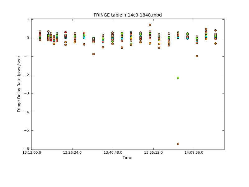
fringefit(vis="n14c3.ms", caltable="n14c3-1848.mbd",
          solint='60',
          combine='spw',
          field='1848+283',
          refant='EF',
          minsnr=50,
          gaintable=['n14c3.gcal', 'n14c3.tsys', 'n14c3.sbd'],
          parang=True)
Note that the signal-to-noise ratio threshold is a parameters that needs to be tuned carefully according to the kind of source you are working with. In this Network Monitoring Experiment, all the sources are bright and it is fine to use a threshold of 50; any baseline with less is suspicious. With more challenging observations the value may need to be reduced even for the phase calibrator and in some contexts when there is no phase calibrator available and you have to fringe-fit on the target source the SNR threshold may need to be reduced to values as low as 5 or even 3.
This step can take a while! (Long enough to have a coffee and check your email; it shouldn’t take hours on this data set.) It should end with a triumphant, but slightly cryptic, remark like this:
fringefit::::   Calibration solve statistics per spw:  (expected/attempted/succeeded):
fringefit::::     Spw 0: 22/22/22
fringefit::::     Spw 1: 0/0/0
fringefit::::     Spw 2: 0/0/0
fringefit::::     Spw 3: 0/0/0
fringefit::::     Spw 4: 0/0/0
fringefit::::     Spw 5: 0/0/0
fringefit::::     Spw 6: 0/0/0
fringefit::::     Spw 7: 0/0/0
fringefit::::   ##### End Task: fringefit            #####
The multi-band solver sees the combined spectral windows as a single spectral window, which it labels as spectral window (Spw) 0 for book keeping. That means that when we apply this calibration solution we have to use a spectral window map (spwmap), as below. Here we have 8 actual spectral windows, and we want to use the multi-band solution for spw 0 to calibrate all of them (you can also explicitly type a list of eight zeros if you like typing). For the other calibration tables we don’t need to specify anything, but we do need to explicitly tell CASA we have nothing to specify by using empty lists, one for each calibration table.
applycal(vis="n14c3.ms",field="1848+283,J1849+3024",
         gaintable=['n14c3.tsys', 'n14c3.gcal',
                    'n14c3.sbd', 'n14c3-1848.mbd'],
         interp=[],spwmap=[[], [], [], 8*[0]], parang=True)
We plot the rates with plotcal:
As we discussed above, the amplitude across the spectral windows isn’t particularly flat:
plotms(vis='n14c3.ms', xaxis='frequency', yaxis='amplitude',
       ydatacolumn='corrected',antenna="EF", correlation='ll,rr',
       coloraxis='baseline', timerange='13:18:00~13:20:00')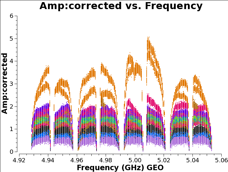
This is another instrumental effect, like the instrumental delay we already calibrated, and it can be removed with the bandpass task, which calculates a complex (amplitude and phase) correction. As with the instrumental delay, we don’t expect it to change very much with time.
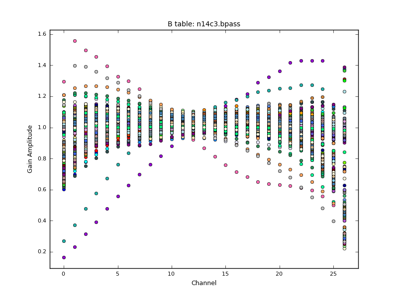
bandpass(vis='n14c3.ms', caltable='n14c3.bpass', field='1848+283',
         gaintable=["n14c3.tsys", "n14c3.gcal",
                    "n14c3.sbd", "n14c3-1848.mbd"],
         solnorm=True, solint='inf', refant='EF',
         bandtype='B', spwmap=[[],[],[], 8*[0]], parang=True)
Note that we combine scans to increase signal-to-noise for the bandpass, but since this is the default it is not shown in the above syntax. We can plot the solutions calculated with plotcal. The solnorm parameter causes the bandpass calibration solutions to be normalised to unity, which means the total amplitude of the data will be preserved. The CASA documentation recommends against doing this when the bandpass is the final calibration step, but we want to preserve the gain values from our a priori amplitude calibrations.
We now apply all corrections to the calibrator fields to inspect if the calibration has worked as expected.
applycal(vis="n14c3.ms", field='1848+283,J1849+3024',
         gaintable=["n14c3.tsys", "n14c3.gcal", "n14c3.sbd",
                    "n14c3-1848.mbd", "n14c3.bpass"],
         spwmap=[[],[],[], 8*[0], []], parang=True)
Then plot the bandpass of the calibrator with plotms
plotms(vis='n14c3.ms', xaxis='frequency', yaxis='phase',
           ydatacolumn='corrected', antenna="EF", correlation='ll',
           coloraxis='baseline', field='1848+283',
           averagedata=True, avgtime='120')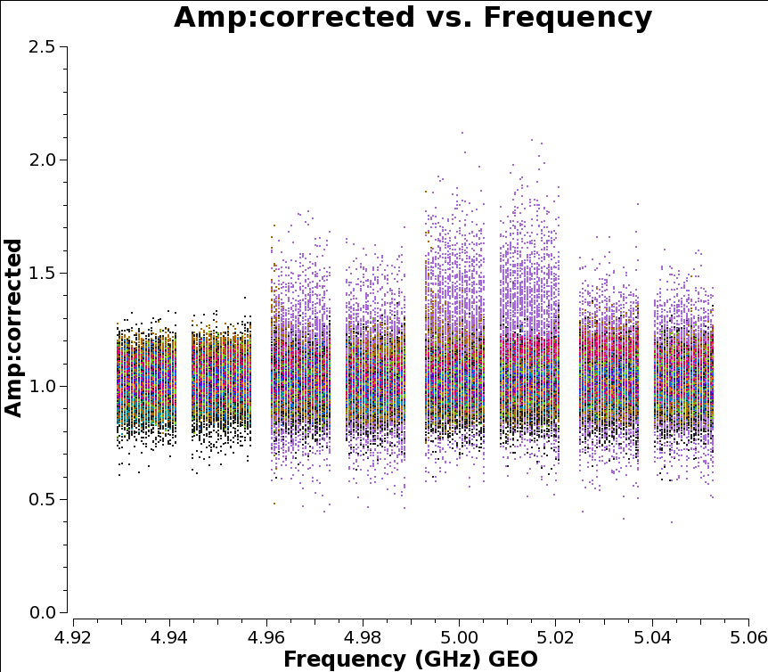
For the calibrator source the amplitudes are now looking excellent. We can also inspect the impact of the calibration on the amplitudes plotted above:
plotms(vis='n14c3.ms', xaxis='frequency', yaxis='amplitude',
       ydatacolumn='corrected',antenna="EF", correlation='ll,rr',
       coloraxis='baseline', timerange='13:18:00~13:20:00')
Though the amplitudes are indeed flattened, there are gain offsets between the stations that are not corrected in the calibration. These can be corrected by self-calibration using e.g. DifMap to model the source improve the gain corrections.
After the bandpass has been applied the amplitudes look much flatter, but the corresponding weights will change with them; it won’t affect the averaging - see Appendix F of the Casa cookbook for details on the relation between weights (which scale with calibration) and the ‘SIGMA’ column (which doesn’t) of the measurement set. What will change, is the phase: a complex bandpass can remove non-linear instrumental phase effects, and this will help flatten the phase across the band and improve the signal-to-noise ratio on averaging. The essence of calibration, as was hinted above, is correcting the data so that averaging simply increases signal-to-noise. The correlation process itself is after all fundamentally a form of averaging signals to boost signal to noise; all we’re doing here is extending that process beyond what can be accomplished with the raw data.
When we’ve done all this calibration, the next step is to (finally!) make an image.
When we start imaging, we often split out the data for different sources. Here we keep both our phase reference source and our “science target” in the same measurement set, but we split off a new measurement set with all the calibration tables applied. In more elaborate versions of imaging we go round a loop of self-calibration several times and it is convenient to have a new measurement set each time to keep a record of the process.
split(vis='n14c3.ms', field='1848+283,J1849+3024',
      outputvis='n14c3-calibrated.ms', datacolumn='corrected')
The details of the tclean task are explained in more detail in the NRAO CASA tutorial. For our purposes most of the following parameters are just incantations, but we do have to make two choices. Firstly, the cell or pixel size. This should be chosen such that there are 5 to 10 pixels across the beam. To find the beam size, we take look at the maximum size of the UV coverage in wavelengths, which can be plotted as UVWave in plotms. It doesn’t matter what you choose for the y axis, but the following is colorful:
plotms(vis='n14c3.ms', xaxis='uvwave', yaxis='amplitude',
       ydatacolumn='corrected',antenna="*&*", correlation='ll,rr',
       coloraxis='baseline')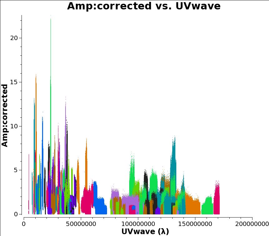
If your UV coverage was very different for different sources you would presumably want to filter the plot on that too. But that’s not the case here and I chose 1.4e08 as my UV value.
Then you can calculate the cell size as 206265/(longest baseline in wavelengths)/(number of cells across the beam), which in this case comes out as about 0.3 milliarcseconds for five pixels across the beam.
Secondly, we need to choose an image size. I’ve chosen 500x500 here, corresponding to 100x100 beam-widths. For a compact, well-centred source this is enough; for a more extended or less well-centred source it might be desirable to increase the dimensions of the image.
Alternatively, you can use the au.pickCellSize function described in this guide.
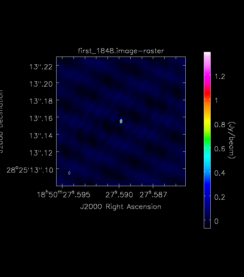
Then we can invoke tclean for our two sources. First the calibrator:
tclean(vis='n14c3-calibrated.ms', field='1848+283',
       imagename='first_1848', specmode='mfs',
       nterms=1, deconvolver='hogbom',
       gridder='standard', imsize=[500, 500],
       cell=['0.3mas'],  weighting='natural',
       threshold='0mJy', niter=5000,
       interactive=True, savemodel='modelcolumn')
To make tclean work, find the oval-drawing tool and draw an oval around your source; double-click inside to activate it (it will turn white) and press the green-circle-arrow button. When it finishes press it again, until the residuals inside your oval have the same color scheme as the ones outside. Then you can stop and view the actual image:
It is important to stop cleaning at the right moment: too little cleaning can leavel large residuals in the image, cleaning too much can create fake structures. When launching a number of iterations via the interactive tool, one should also set cyclethreshold (a different argument than threshold) to a small number, otherwise tclean might do very few iterations for each cycle.
Repeat this process for the science target:
tclean(vis='n14c3-calibrated.ms', field='J1849+3024',
       imagename='first_J1849',specmode='mfs',
       nterms=1, deconvolver='hogbom',
       gridder='standard', imsize=[500, 500],
       cell=[' 0.3mas'], weighting='natural',
       threshold='0mJy', niter=5000,
       interactive=True, savemodel='modelcolumn')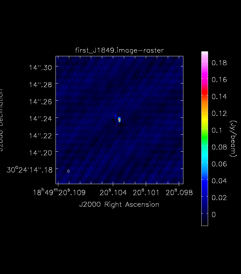
You will see that in both cases the source recovered is roughly the size of the beam (shown in the bottom left corner).
We have shown that you can get EVN VLBI data straight out of the archive, together with the a priori amplititude calibration information, and calibrate and image it using CASA and a few additional Python scripts.
Fringe-fitting is included in version 5.3 of CASA, and problems can be reported to the regular NRAO helpdesk. The fringefit routine is maintained at JIVE by Des Small; the a priori calibration tasks are maintained by Mark Kettenis. In the immediate future it may be convenient to contact these developers directly with VLBI problems. Note that we have no special expertise with general CASA tasks such as plotms or tclean.
Note that this page is based on
and also draws on
We also thank Kazi Rygl and Elisabetta Liuzzo of INAF-Istituto di Radioastronomia for their helpful comments on a previous draft of this tutorial.